DSCC BRAND RESOURCES
Logos, Icons, Fonts and Colors
ABOUT THE LOGO
The DSCC logo is comprised of three elements
- The Logo Symbol
- The Logo Type
- The Tagline
The LOGO SYMBOL is a symbol that represents the three pillars of who DSCC is. Wisdom, Maturity and Experience encompasses both the attributes of the senior community we serve and what DSCC brings to the community.
The LOGO TYPE is our official and legal name.
The TAGLINE communicates that we provide much more to seniors and our community than delivering meals. The ‘more’ is who we are.
DSCC LOGOS
Below are the approved DSCC logos.
DSCC Horizontal Logo With Tagline
With and Without Address
Whenever possible, please include the “Providing Meals and More” tagline when using the logo. If in your application, the tagline becomes too small to read, you may omit it from the layout.
DSCC Stacked Logo With Tagline
With and Without Address
USING THE DSCC LOGO
Safe Space
The DSCC Logo always needs safe space that is free of imagery and text surrounding it. Use half the Icon’s width to determine the minimum amount of safe space that should surround the Logo.
If copy appears below the Logo, you should measure safe space from the bottom of the Logo to the x-height of the text.
Minimum Size
The words “DuPage Senior Citizens Council” should always be easy to read.
What Not To Do With The Logo
The DSCC Logo is a symbol people recognize, so it should never be altered.
Here are a few examples of what not to do with the DSCC Logo.
- Do not change the spacing between the icon and the words “DuPage Senior Citizens Council” or its letters
- Do not use any colors other than blue or white
- Do not use a different typeface for “DuPage Senior Citizens Council”
- Do not move the position of the triangle icon
- Do not use the logo without the triangle icon
- Do not change or replace the word “DuPage Senior Citizens Council” in any way
- Do not use the word “DSCC” to represent DuPage Senior Citizens Council in logo form
- Do not change the shape of the logo
- Do not use the Logo in a phrase or sentence
Note: This is not an exhaustive list!

Logo Color Versions
There are two versions of the logo – one with blue type and one with white type but the type inside the triangle icon should always be blue.
Use the gray-blue logo on a light background. Use the white logo on a dark background.
Using the Logo on solid backgrounds
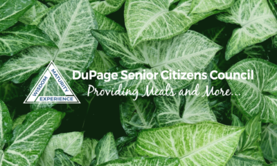
These examples show the correct application of the DuPage Senior Citizens Council Logo on different solid backgrounds.
The blue logo should be used on a background that’s lighter than 40% gray. The white logo should be used on a background that’s darker than 50% gray
Using the Logo on other backgrounds
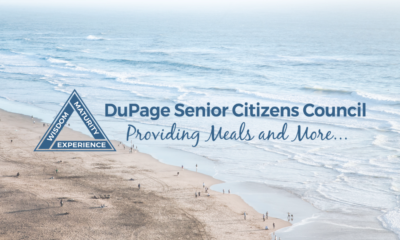
These examples show the correct application of the DuPage Senior Citizens Council Logo on different backgrounds.
The blue logo should be used on a background that’s lighter in nature while the white logo should be used on a background that’s darker. Always ensure that the logo is readable against any background.
LOGO COLORS

Blue on the site and logo
#476a89, rgb(71, 106, 137)
Pantone 7699c

White in logo
#FFFFFF, rgb(255, 255, 255)

Green accent in digital media
#98bd45, rgb(152, 189, 69)
FONTS
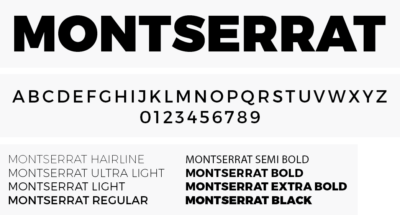
Montserrat is the official font for DSCC
We use Montserrat font in graphic applications for the body and headline text.
You can download the Montserrat font family here.
NEED HELP WITH THESE BRAND RESOURCES
Any usage of DuPage Senior Citizens Council brand elements needs special approval and must be submitted the Brand Use Request Form for review. DuPage Senior Citizens Council reserves the right to object to any inappropriate uses of its trademarks and to enforce its rights at any time.


